WEBP COMPRESSION LAB

How low can the quality setting go before the image looks bad?

There is no universal WebP percentage that works for every image. A portrait, a cloudy sky, a screenshot and a product photo fail in different places. The practical target is the smallest file that still survives the details your viewer will notice.

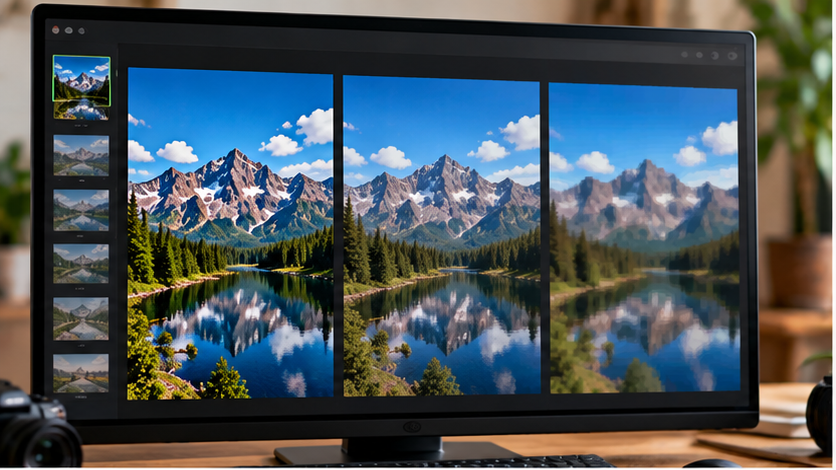
Same image displayed at several visual quality levels for WebP compression comparison
95very light loss
85common high-quality range
75more aggressive
60inspect carefully
40artifacts may dominate
THE FIRST RULE

Do not choose quality from the number alone.

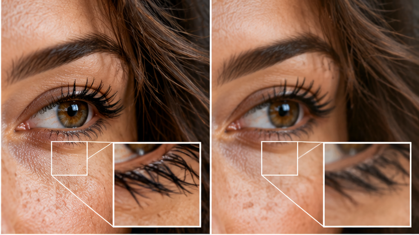
Close-up image showing fine detail such as hair and fabric under compression
TEST 01 / FINE DETAIL

Hair, fabric and foliage reveal damage early.

Lossy compression can simplify texture and create smearing around fine high-contrast detail. Look at eyelashes, hair strands, fabric weave, grass, branches and small product lettering before accepting a lower setting.

Inspect the exported file at the size it will actually be shown. A defect that is obvious at 300% zoom may not matter in a 400-pixel card, while the same defect can be distracting in a large product image.

THREE TESTS

Different image content breaks differently.

01 / EDGES

Text and sharp boundaries

Look for ringing, colored fringes and mushy small lettering. Graphic content often needs a more conservative lossy setting—or a lossless route.

02 / TEXTURE

Skin, hair and complex surfaces

Watch for waxy skin, smeared strands and texture that suddenly becomes patchy. Faces attract attention, so modest compression defects can feel more obvious.

03 / GRADIENTS

Sky, shadows and smooth color

Large smooth areas can reveal banding or block structure. A file can look sharp around objects while the sky quietly falls apart.

Smooth sky gradient compared with a version showing visible compression artifacts
TEST 02 / GRADIENTS

Smooth areas can fail before the subject does.

A sky, studio backdrop or shadow transition may show banding or contour-like steps as compression becomes more aggressive. These flaws are easy to miss when you only inspect the center subject.

Open the result on a normal display at normal brightness. Do not make the final decision from a tiny editor thumbnail.

WORKING METHOD

Find the threshold instead of guessing it.

A

Start higher than you think you need

Create a clean reference export. This gives you something to compare against instead of judging each file in isolation.

B

Drop quality in meaningful steps

Try a few separated settings rather than exporting every single percentage. Once you notice damage, move back upward and narrow the range.

C

Compare file size and visual cost together

If dropping from one setting to another saves only a tiny amount but visibly harms the image, the lower setting has no practical advantage.

QUALITY VS SIZE

The best setting is the smallest one that still passes your visual test.

WebP supports both lossy and lossless compression. In lossy mode, stronger compression trades away image information for a smaller file. MDN recommends compressing as much as practical while keeping acceptable visual quality; the acceptable point depends on the content and use case.

MDN’s format guide documents WebP’s lossy/lossless modes and alpha support.

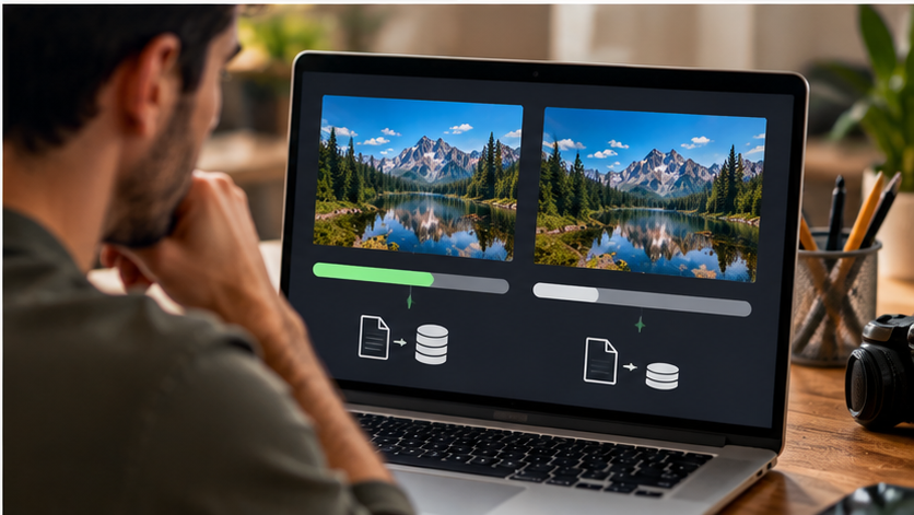
Person comparing a smaller WebP file with an acceptable visual quality result

Export, compare, then stop compressing when the visual loss becomes more valuable than the bytes you save.

Open Image to WebP →