
How many pixels are stored?
Example: 1600 × 900 px. This is the intrinsic raster size of the file.
The correct source depends on the slot, responsive layout, screen density and the image itself. Treat pixel dimensions, display dimensions and file weight as three separate decisions.

Example: 1600 × 900 px. This is the intrinsic raster size of the file.
A 1600 px source might be rendered at 800 CSS pixels wide on the page.
Format, compression and content complexity affect KB or MB independently of dimensions.
These are working ranges, not platform laws. Your theme and layout still decide the real requirement.
Use a source large enough for the maximum rendered width and high-density displays, then let responsive markup serve smaller versions where possible.
If the column peaks around 760 px, a source around 1200–1600 px can leave room for denser displays without shipping a giant master everywhere.
layout dependentDo not send a 3000 px original into every 320 px card. Generate a purpose-sized derivative.
match the card familySVG avoids the usual raster sizing problem for simple vector artwork and UI graphics.
vector first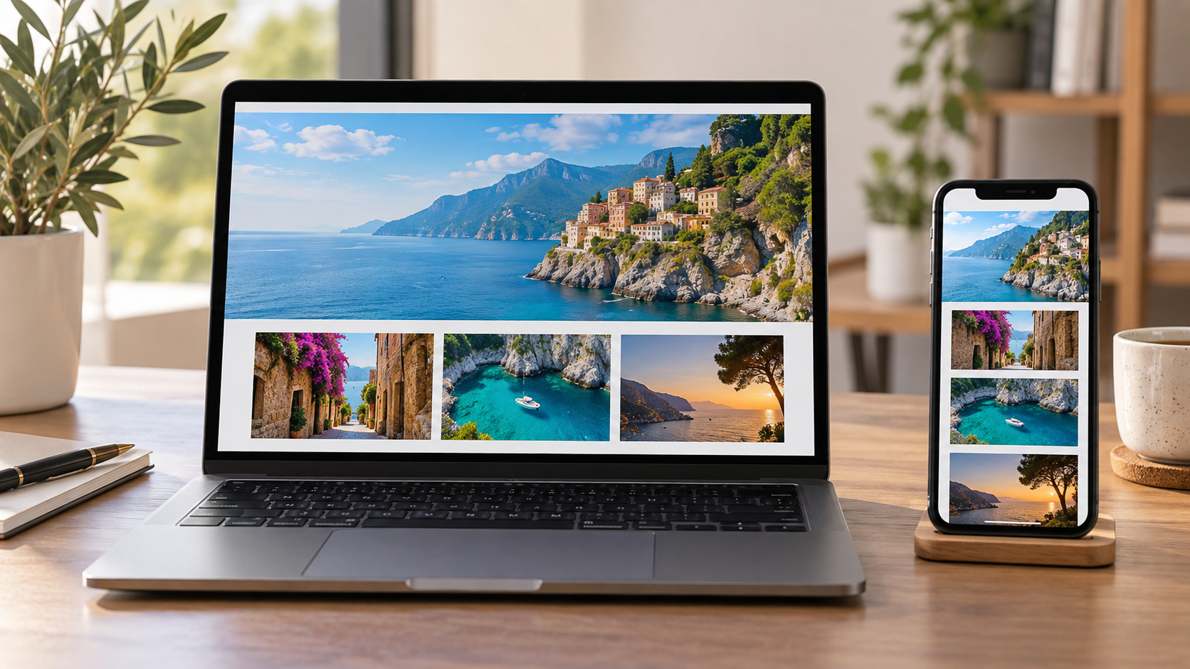
HTML can expose multiple image candidates through srcset and describe expected layout width through sizes. The browser then chooses an appropriate resource for the viewport and device conditions.
This is more efficient than forcing every visitor to download the largest source, and sharper than stretching a tiny derivative into a wide slot.
That does not mean every 600 px slot must always download a 1200 px file. It illustrates why a source that matches only the CSS width can look softer on a high-density display.
Pixel dimensions tell you how many samples the image contains. File weight depends on encoding, compression, color information and visual complexity. A detailed PNG can weigh more than a larger photographic WebP.
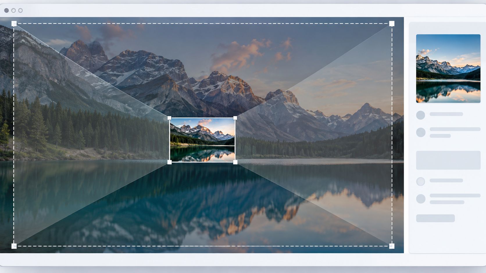
Inspect the real layout, not the image file. A content column, card and hero have different needs.
If mobile needs a tighter crop, create that crop intentionally instead of relying on accidental overflow.
Generate a small family of useful dimensions rather than dozens of near-identical files.
Photograph, screenshot and transparent graphic do not compress the same way.
Quality should be judged in the actual layout on more than one screen size.
srcset, sizes, intrinsic dimensions and resolution switching.